CASTELLI REBRAND
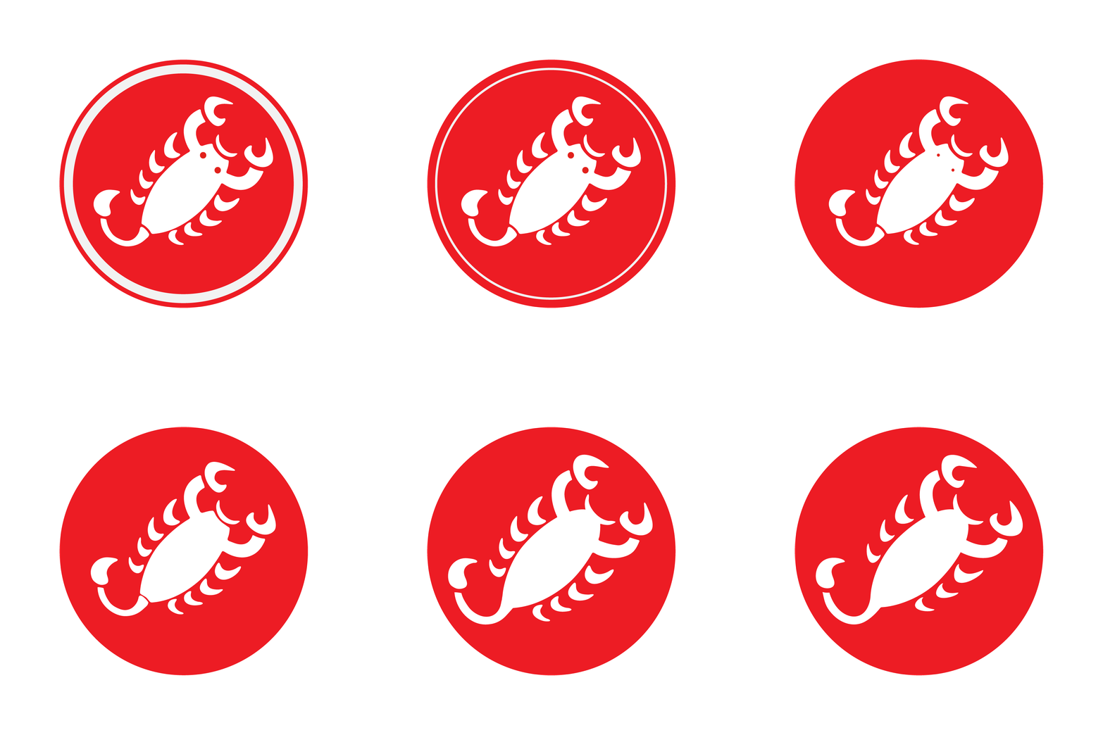
The Castelli brand is best known for its white scorpion inside a red circle. By 2024, the logo had become so dominant it was limiting the design team, forcing every collection and campaign to work around red. The word mark had also grown to feel overly complicated.
A few subtle changes made a big difference. We simplified and sharpened the scorpion, stripping away the big round eyes, rounded claws, extra legs, and softened shapes. What remains is the essence of a predator.
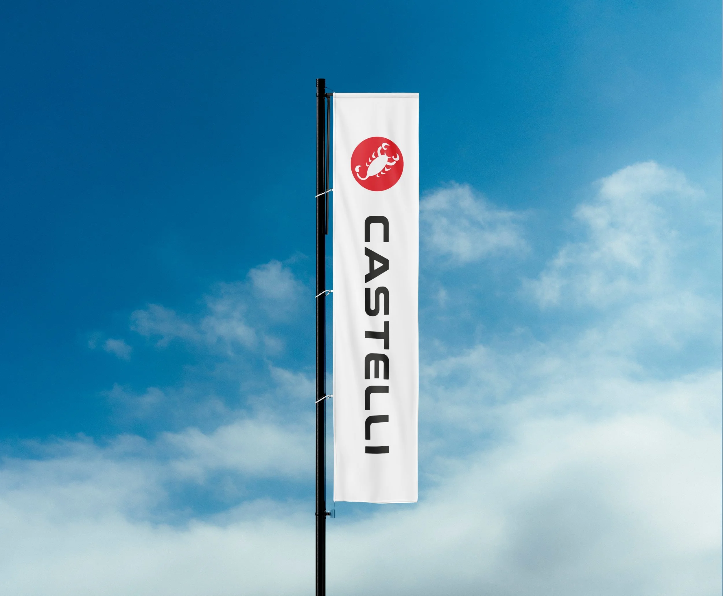
The word mark got the same treatment. We refined the retro letterforms, brought consistency to the typography, and created something cleaner, more confident, and unmistakably Castelli.
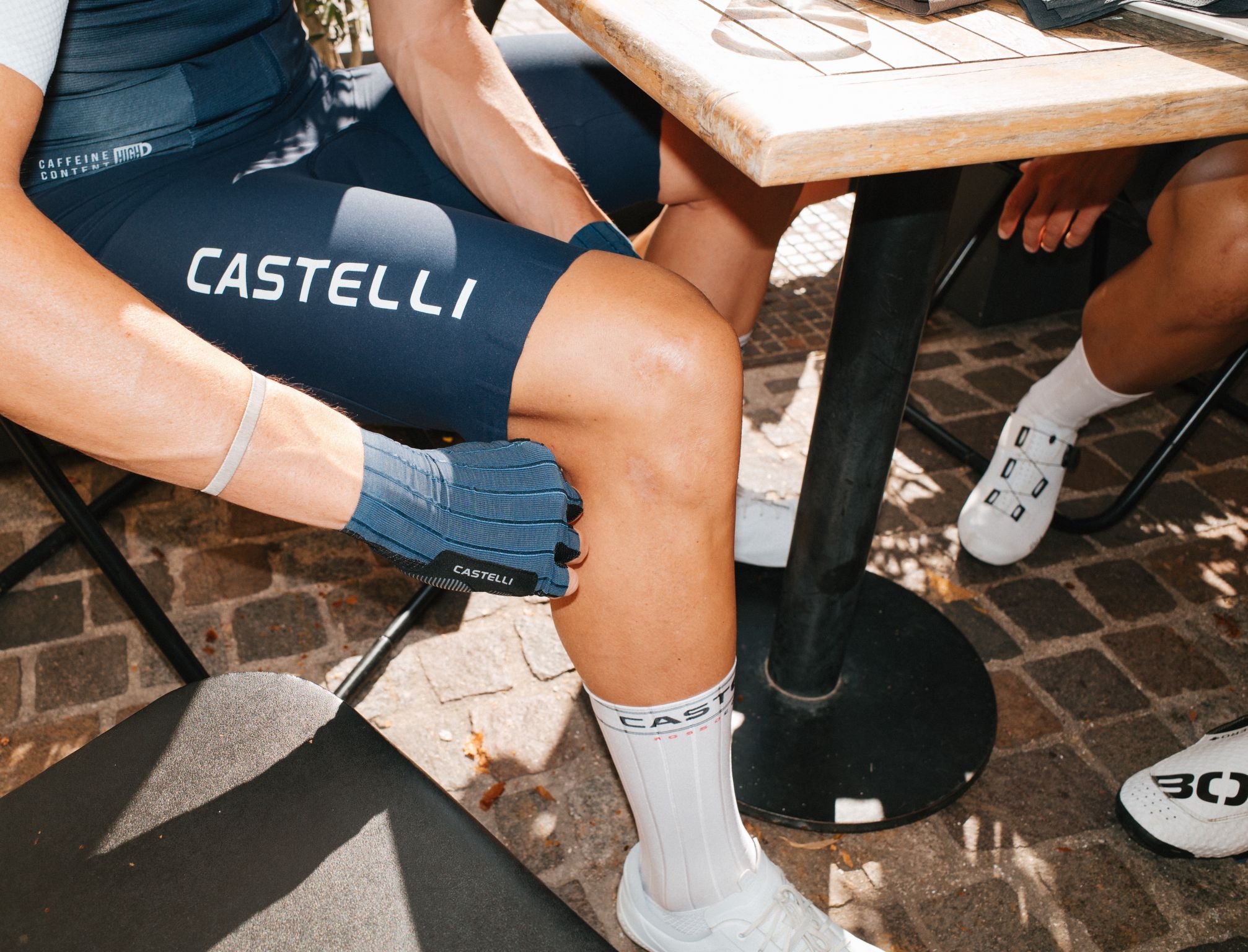
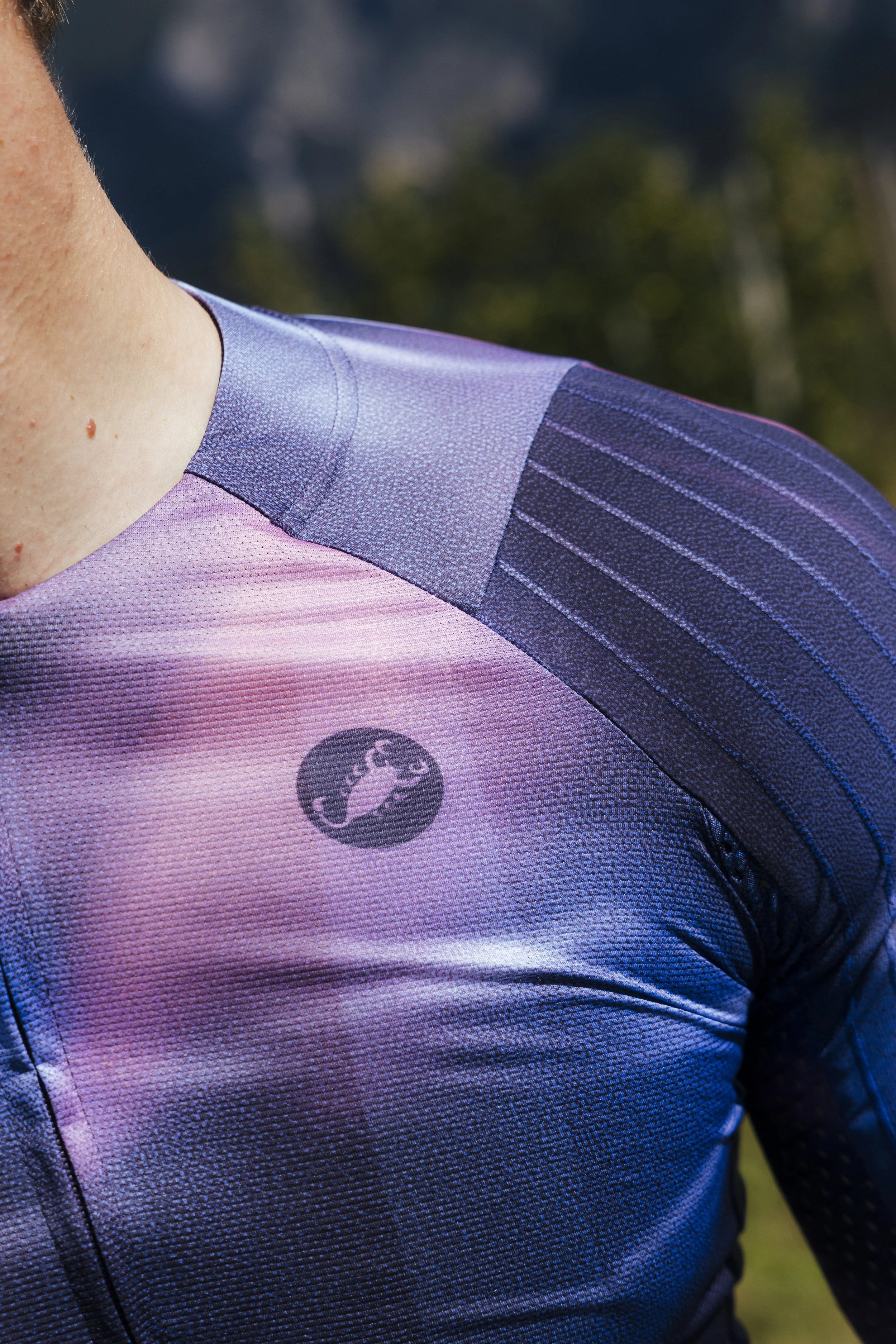
The redesign unlocked the brand. It gave the design team permission to think differently, embrace bolder graphics, explore more adventurous color palettes, and find fresh ways for Castelli to show up, from race kit to marketing campaigns.



Before

After